Settings
The following settings are primarily for example purposes only. Settings made on this page are not stored or saved for future use. neither are the settings applicable to other pages within this website.
Project Goals
1. Establish list order based on commonly used features as well as accessibility preferences.
2. Investigate proper UI adjustments for right-to-left text options.
3. Investigate proper support for dyslexic users.
Tools: HTML, CSS, Javascript.
Establish list order based on commonly used features as well as accessibility preferences.
Process: Benchmarking, Ranked-Order Polling
Constraints: Target audience and feature list for other sites vary significantly from my own.
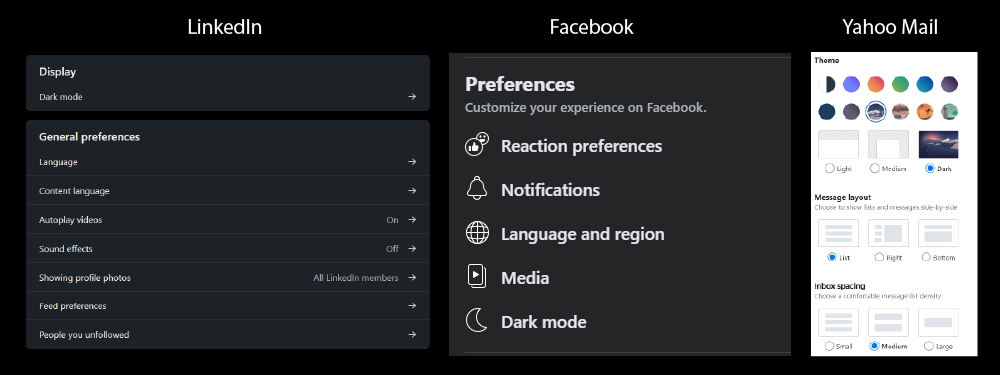
First I did some benchmarking on other websites settings pages. Through this I determined that dark mode was the most common setting, followed by languages with font and sound related adjustments being less common.
Additionally, I sent a poll out asking people to order the included settings from top to bottom with the settings that they expect more people to find value in at the top and those settings which may be less frequently sought after at the bottom.
Investigate proper UI adjustments for right-to-left text options.
Process: Interview
Constraints: Limited interview subjects and translation resources.
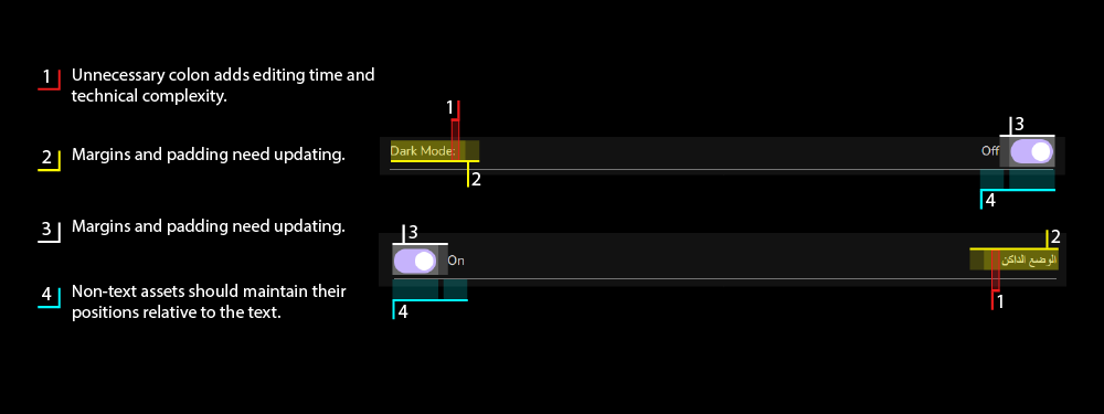
For this project, I made a point to ensure that I interviewed someone with Arabic proficiency. Because the technical implementation needed to coincide with the translations I would have been unable to properly define proper UI adjustments without their insight.
Investigate proper support for dyslexic users.
Process: Interview
Constraints: Limited interview subjects and open source fonts.
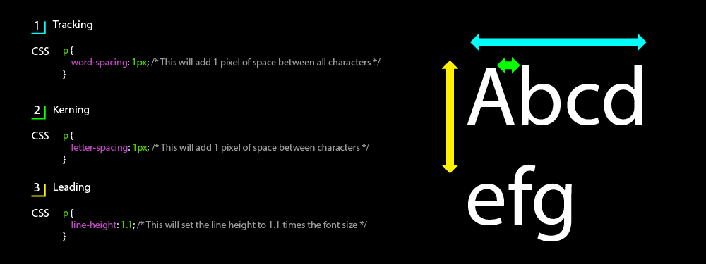
In order to better support dyslexic users I interviewed a friend with mild dyslexia. While the primary takeaway was to add a dyslexic-friendly font, it was also brought to my attention the value of individually adjusting leading, kerning and tracking. While this level of granularity isn't currently implemented I created the reference in the image above to keep on hand for the next opportunity.
Sound Effect by floraphonic from Pixabay.
Dyxlexic friendly font by OpenDyslexic.org.