Galaxy in Turmoil
Multiplayer PVP Shooter Game
Galaxy in Turmoil is a free-to-play multiplayer sci-fi shooting game. It leans heavily into easy and fast transitions from ground to flight combat and features four special game modes.
Overview
Problem: Create an authentic feeling futuristic shooter UI that addresses the unique differences of combat on foot, in ground vehicles or in flying vehicles and remains compatible with the unique gameplay objectives of four different game modes.
Platform: Steam
Process: Information Architecture, Wireframe, Mockup, Prototype, Shipped Deliverable
Tools: Unreal, Blueprints, Illustrator, Photoshop, After Effects
My Role:
- Designed and implemented multiple weapon system UI's with attention to detail on the differences in player expectations and overall experience
- Created UX/UI for new "Siege" game mode, accounting for the learning curve associated with playing a system without precedent
- Iterated on numerous features such as menus, player lobby and vehicle HUD's to determine best feel and aesthetic within the game world
Design Challenges and Solutions
1. Synergize Crosshair Motion/Art with Weapon Type
2. Use UI to Teach Players Game Mode Mechanics
3. Clear & Consistent Visual Language
Synergize Crosshair Motion/Art with Weapon Type
Goals: Create crosshairs/reticles that convey a unique sense of the traits and effects of the items to which they belong.
Constraints: UI art complexity and motion timing must communicate appropriate levels of information with immediate feedback for each weapon state without disrupting gameplay.
Different weapons have different weight, ammo and other physical and behavioral properties that should be reflected in the UI art and motion design for the crosshair/reticle. The crosshair should expand or compress in unique ways and should be able to communicate to the player the functional details of the weapon during each stage such as firing and reloading the weapon. At the same time, this motion and art complexity shouldn’t distract the player from shooting, either because of visual complexity or poor timing.
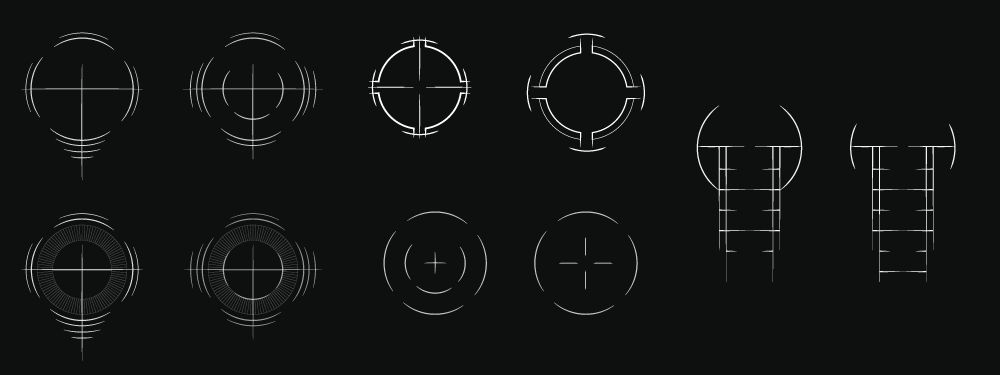
The process began with brainstorming and mocking up dozens of crosshair concepts before categorizing them into appropriate weapon groups and adding functional details or removing unnecessary aesthetic details.
Next, I made a few motion designs in After Effects to establish a few of the core driving movements associated with different weapon behaviors. Finally, I used Unreal to implement and fine-tune them to account for the unique characteristics of each weapon.
Use UI to Teach Players Game Mode Mechanics
Goals: Design Siege game-mode UI that intuitively conveys potentially unfamiliar game-mode mechanics to new users.
Constraints: Certain mechanics of the Siege game mode are unique to Galaxy in Turmoil. New players would need the UI to serve as the primary vehicle to their learning process for these new mechanics.
When designing UI for a new game mode, we needed the players to have a clear understanding of the overarching win conditions of the match along with the smaller goals embedded into gameplay that help them attain a victory.
The Siege game mode essentially merged together several elements of standard "Capture the Flag" and "King of the Hill" game modes. This meant that players had to time-unlock or "capture" certain points in contested territory before they were expected to transport an item across the map.
We chose to rely heavily on progress bars to communicate the "unlocking" mechanic. Since multiple points needed to be unlocked we used filled/unfilled dots to keep track of how many points on the map have been captured. We did something similar for the "flag" that needed to be transported, but we separated it from the capture point UI and used more distinct effects to communicate the urgency of this last "task".
Clear & Consistent Visual Language
Goals: Create and maintain a clean and simple, yet futuristic UI aesthetic.
Constraints: The full art direction was not established and there wasn't clear awareness as to all the environmental colors and objects expected in the game.
The goal was to create a believable futuristic aesthetic that adopted a level of variety that could be found across multiple planets. With such a wide range of color and aesthetic possibilities it was important to keep UI stroke weights and colors compatible with a host of different environmental possibilities.
We chose to focus on a light grey/white in-game UI, with the expectation that most environments would emphasize a darker color pallette allowing for good contrast.