Troubadours on Tour
Casual Strategy Board Game
Troubadours on Tour is a tactical movement game for two-four players. Prior to launching on the Gamecrafter, I tested the game with ~100 testers including three fully unguided playtests and a variety of specialized tests to validate the rulebooks' efficacy for first time players. Throughout the course of development I was able to reduce component costs by ~57% without making sacrifices to gameplay or set up effort.
Overview
Problem: Design a board game experience that’s intuitive for first-time players, affordable to produce, and easy to set up without sacrificing depth or enjoyment.
Platform: Tabletop game on The Gamecrafter
Process: Wireframe, Prototype, User Testing, User Interviews.
Tools: Paper-Prototypes, Illustrator, Photoshop, G Suite, Figma, After Effects.
My Role:
- Lead designer and developer of the entire player experience
- Created all visual assets and component UX (excluding character art)
- Conducted iterative testing and implemented user feedback
- Balanced constraints between usability, gameplay, and production costs
- Tested prototypes with ~100 users (casual to experienced gamers)
- Observed setup behavior, rulebook usage, and gameplay flow
- Collected qualitative feedback and monitored hesitation/confusion points
- Identified common UX blockers in traditional board games, like complex rulebooks and non-intuitive setup
Design Challenges and Solutions
1. Board Design That’s Functional & Affordable
2. Rulebook & Learning Curve Optimization
3. Cohesive Theme & Mechanic Integration
4. Clear & Consistent Visual Language
Board Design That’s Functional & Affordable
Goals: Ensure components support game mechanics, remain visually thematic, and minimize printing costs.
Actions:
- Redesigned character pieces from standees to flat chipboard tokens, increasing design and usage versatility
- Improved component accessibility and ergonomics, making it easier for players to identify and control their characters on the board
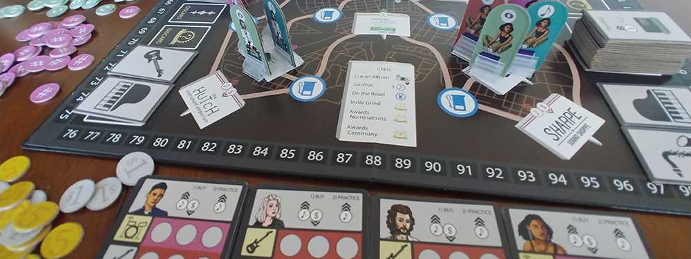
Beyond the game board and box, the largest component cost came from the character standees. While these components felt satisfying to move around the board, they introduced the risk of players having difficulty identifying which colors were theirs and which artist they were controlling. This was primarily due to the view angle and the complexity of the artwork. By changing the component type and stripping down the art complexity, I was able to both increase the options for how this component could be used and improve the user’s ability to identify and manipulate the correct artist token. Additionally, the increased component versatility allowed for the reduction in overall component costs as well.
Rulebook & Learning Curve Optimization
Goals: Make the rulebook accessible for groups without a “rule explainer.”
Actions:
- Ensured rulebook comprehension by observing fully unguided playtests on 3+ iterations of the rulebook
- Further validated rulebook comprehension by conducting summary task activities with testers without exposure to components
A consistent impediment to a player’s experience with a board game comes from difficulty learning the rules without an experienced player present. To circumvent this problem, I approached the rulebook with a variety of methods. I conducted interviews with people who read the rulebook but had no exposure to the components or the game. I also conducted similar interviews with players who had already had experience testing the game with myself as a guide. This form of A/B test allowed me to identify whether aspects of familiarity with the game and mechanics led to conflicts of understanding in the rulebook. Additionally, I conducted summary tasks with people who had no exposure to the game; asking them to explain a mechanic to me based on a section in the rulebook. FInally, I conducted multiple unguided playtests where I observed players reading the rulebook and playing the game in its entirety with no prior exposure. These test methods led to a reliable outcome of new players quickly learning the game with a high degree of accuracy regarding the intended rules.
Cohesive Theme & Mechanic Integration
Goals: Ensure that the game's theme and mechanics are well-integrated and cohesive.
Actions:
- Observed and interviewed players during and after gameplay to identify confusion points surrounding mechanics, graphics and terminology
- Enhanced test confidence by conducting A/B tests on specific design versions
Provided the highly thematic nature of the game, it was often a challenge to adopt mechanics and terminology that didn’t break player immersion. Certain resources and tokens generated several questions from players. This was often an indicator that players had difficulty understanding their relationship to the main theme. The reverse effect was also easily observable; players would more quickly internalize and successfully perform actions when they expressed an intuitive relationship between the mechanic and the theme. To build confidence around selecting the final terminology I conducted dozens of interviews with players. In some cases I would have players use one set of terminology for certain mechanics and components during one test and change the terminology in the next test. These methods helped to close the gaps on a great deal of the pain points and improve the player's ability to retain rules and mechanics as they played.
Clear & Consistent Visual Language
Goals: Create a clear and consistent visual language throughout the game.
Actions:
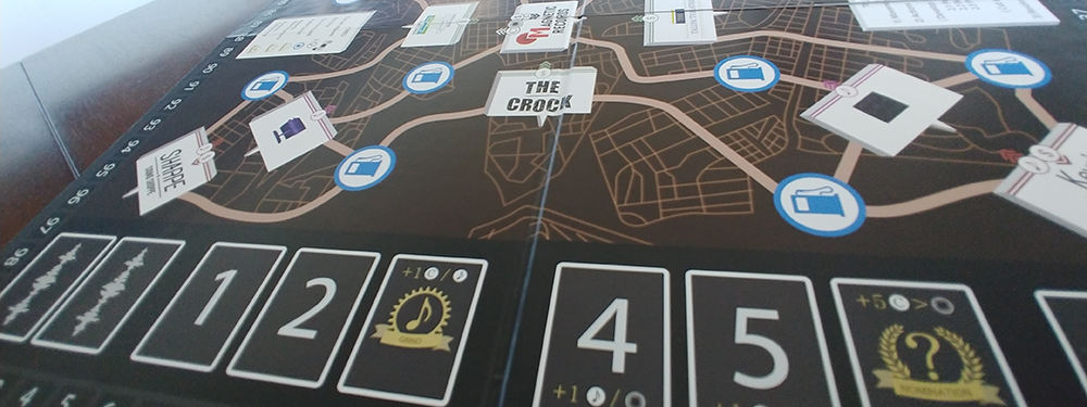
- Enhanced recognition of each location type by identifying it with type-specific icons in addition to the thematic logo
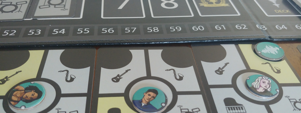
- Accounted for color vision deficiency by identifying each players tokens with an indicator associated with each background color
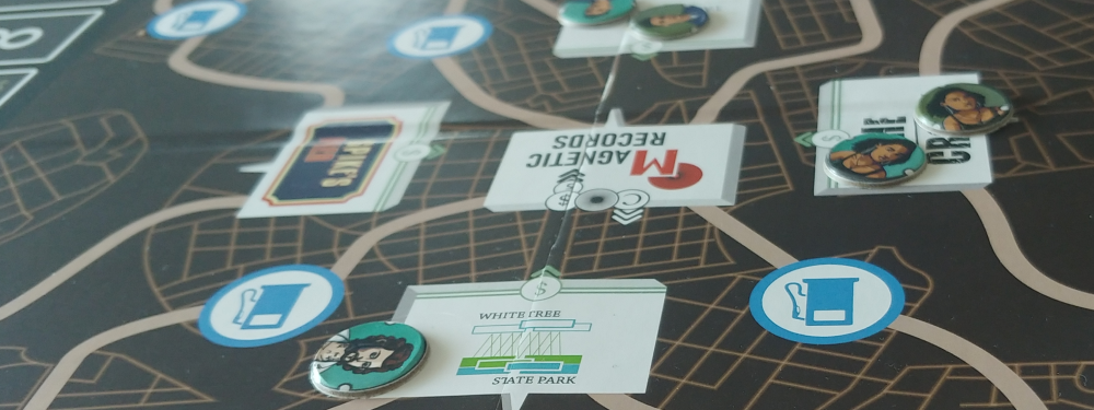
Creating a visual language that felt thematically appropriate sometimes felt incompatible with clearly identifying how assets relate to game mechanics. Locations on the board each contained “company logos”, but player’s were not immediately inclined to read the logo and infer its relevance to the game mechanics. I chose to position each location of the same type on the board in a way that could be identified based on their relative position to the center of the board. I also made smaller icons to accompany each space on the board that helped players identify the role of that location. Additionally, regardless of color choice, it is always important to account for players with color vision deficiency. To address this, each player’s tokens included an indicator around each component that could be traced to its specific background color. These adjustments minimized confusion points surrounding who controlled characters and what role each location on the board served.
Outcome & Impact
- Successfully launched on The Game Crafter
- Positive reviews from players
- Reduced component costs by ~57%, making it more affordable and accessible
- Players were able to set up and learn the game with minimal guidance