Kenworth & Peterbilt Infotainment Display
Infotainment System for North American Commercial Vehicles
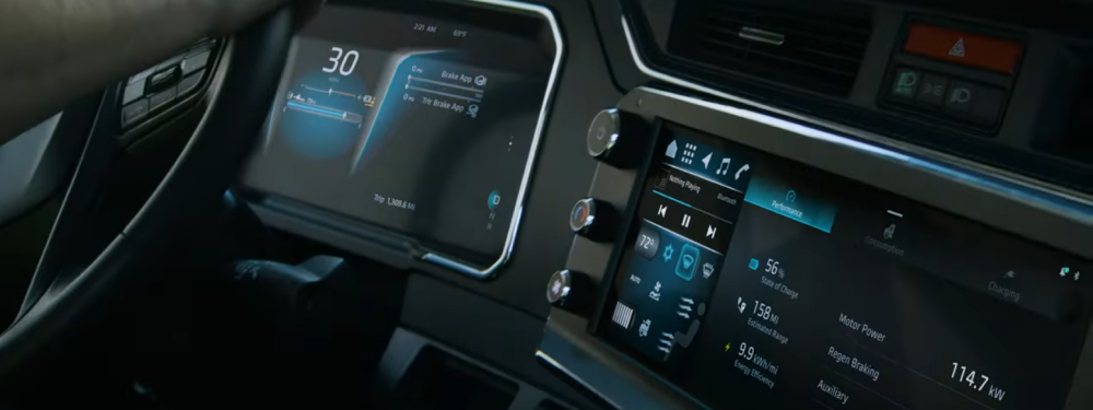
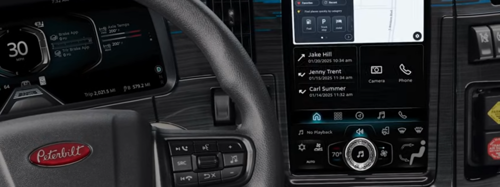
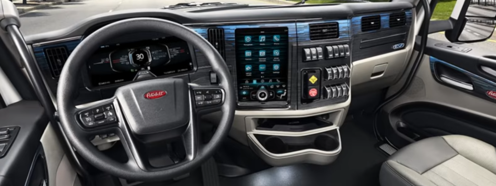
This project marked the first infotainment system developed in house by PACCAR for Kenworth and Peterbilt. I contributed to the user experience design, research and prototyping for the software in both displays. A landscape-oriented Kenworth display with three physical knobs and a portrait-oriented Peterbilt display with one physical knob-on-glass. Most of the information and content on this has yet to be made public and cannot be fully discussed here.
Only portions these projects are currently open to the public.
Overview
Problem: Design a robust display environment that supports the driver’s ability to perform key functions such as HVAC adjustments, navigation and controlling their media without introducing distraction, visibility or other risks to the driver.
Platform: Kenworth and Peterbilt Brand Commercial Trucks
Process: Persona development, wireframing, creating user flows, prototyping, user testing.
Tools: Figma, Illustrator, Photoshop.
My Role:
- Supported design process on features ranging from base systems such as system navigation, interaction patterns and startup to individual apps within the system such as bluetooth media, radio and phone.
- Created complex interactive prototypes that supported seamless navigation throughout the system and across apps with overlay content (i.e. notifications and keyboard) that didn’t disrupt the prototype flow.
- Established a process of testing five prototyped interactions per week, creating consistent progress on designs and prototypes as well as creating a base of questions and identifiable pain points to be resolved in larger-scale user studies.
- Collected quantitative and qualitative data from drivers and other test participants with a focus on driver distraction.
- Test methodology related to addressing driver safety is proprietary. Design constraints associated with driver use-case variety are proprietary.
Design Challenges and Solutions
1. Seamless Prototype Environment That Supports Multiple Test Methodologies.
2. Design System That Supports Diverse Stakeholders.
Seamless Prototype Environment That Supports Multiple Test Methodologies
Goals: Create a Figma prototype environment that allows for seamless user interaction over an open-ended span of time without significant constraints to test methodology or need for tester intervention.
Actions:
- Created full user flow interactions based around navigating between variants of a component.
- Embedded “user flow components” into higher level components. Each level of embedded component contained greater access to system interactions, while retaining lower level states.
This prototype allowed for a great deal of flexibility when designing user studies. Each app was connected to the full system, so there was very little need for the tester to manage multiple prototypes based on the specifics of the test. There was “master” Kenworth prototype and a separate “master” Peterbilt prototype, each operated from a screen that appropriately reflected the final product. Interactions that were not handled by the touch screen were controlled with keyboard inputs (i.e. turning the vehicle on, giving voice commands) Beyond this, the user had nearly complete freedom to explore the system as if it were a finished product. Aside from user testing, this was used in presentations with various corporate stakeholders to help keep conversations clear and effective when discussing product features and behavior.
Design System That Supports Diverse Stakeholders
Goals: Expand the capabilities of the design system to support broader company needs beyond the standard use-cases of creating user flows and prototypes. This included use cases for wireframe-level documentation and marketing content.
Actions:
- Created Figma style for monochromatic wireframes using the same base as system as other key visual styles.
- Created procedure for breaking down design-system components and assets into documentation elements to convert to the document management system.
- Added an extension to the design system where key components were embedded into “Marketing” components with properties and variants tailored around accurately displaying complex system scenarios with minimal setup and component scrutiny.
These expansions to the design system created a flexible environment where the same components could be used across (nearly) the entire product lifecycle. The components could ultimately support both production and wireframe level fidelity through style properties. This is conducive to both designers working in pre production as well as when documenting final results. The marketing additions existed within components that contained situationally accurate variants based primarily around a feature; as perceived from the lens of marketing. This minimized the amount of editing needed to create marketing assets when the product pipeline was ready for this step.